
(Case study · Brand identity)
Center for Global Health Equity Research and Evaluation
CGHERE researches and evaluates health equity. ROQA built the identity that carries that work into the world: the mark, the palette, the type, the guidelines, and every application from a bus shelter to a lanyard.
- Client
- CGHERE
- Engagement
- Phase 2,
brand identity - Scope
- Mark, palette, type,
guidelines, applications - Delivered
- July 2026
The brief
(01)Research earns trust by being legible. CGHERE needed an identity that could sit on a peer reviewed report and a bus shelter without changing its voice. Clinical enough for funders. Human enough for the communities the evidence belongs to.
Equity
Fairness, justice, and the elimination of systemic barriers.
Justice
Challenging inequitable systems, policies, and practices.
Learning
Community wisdom and rigorous research as complementary knowledge.
Impact
Measurable, sustainable outcomes, held accountable in public.
The mark
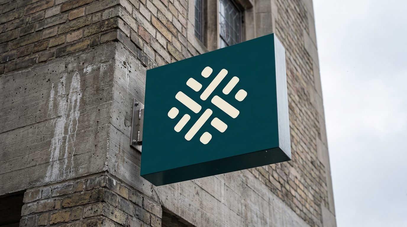
(02)Eight bars radiating from a shared center, four teal and four gold, with four raspberry dots set into the gaps between them. It reads as a compass, a cell, and a gathering, depending on where it lands.
The identity also ships a motion signature for screen use. It lives in the design system.
Built for legibility
(03)Six colors, each with a job. Every pairing in the guide is measured against WCAG 2.1 AA before it is approved. Pairings outside the sheet are not permitted.
Dark Teal
#0E4D4A
Primary. Text, headlines, surfaces.
Raspberry
#C71C59
Accent. Text safe on light surfaces.
Gold
#F4B740
Decorative only. Never body text.
Warm Paper
#F5EFE3
Expressive surface.
White
#FFFFFF
Functional surface.
Black
#1E1E1E
Text on gold. High contrast utility.
Titles and section openers. Semibold, Regular, Thin. Shown here in Nunito, the documented fallback, because Neutronic Rounded is licensed through Typekit.
Everything else. Research, reports, interface, and long form reading.
The guidelines
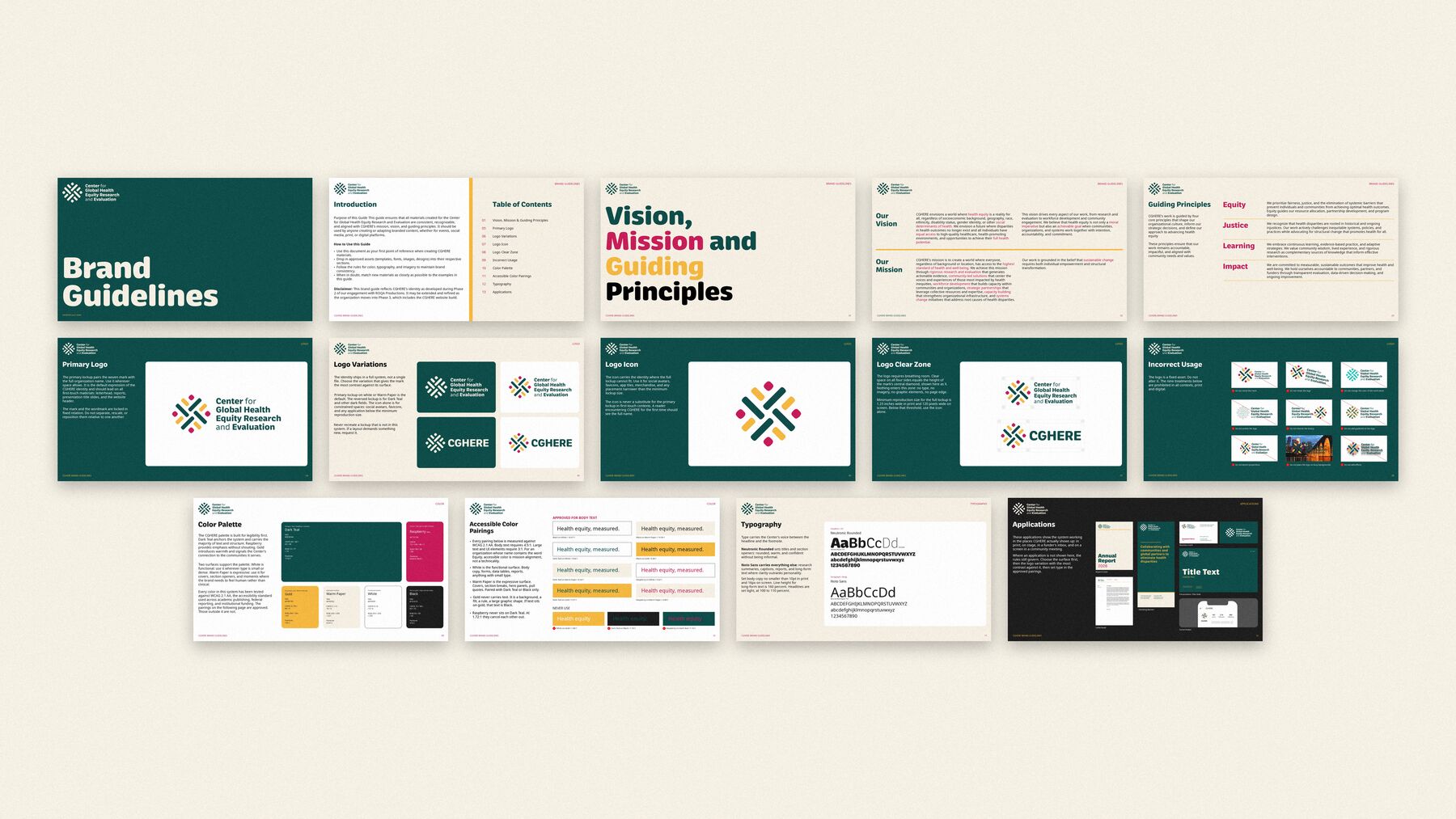
(04)Thirteen sections covering vision and principles, the logo and its variations, clear zone, incorrect usage, color, accessible pairings, typography, and applications. Written so anyone making a CGHERE asset can make it correctly without asking.
Out in the world
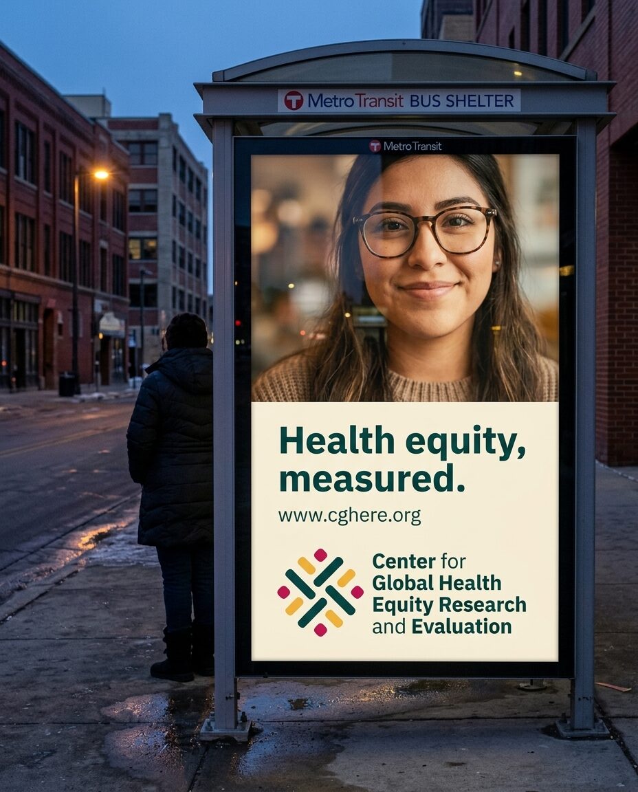
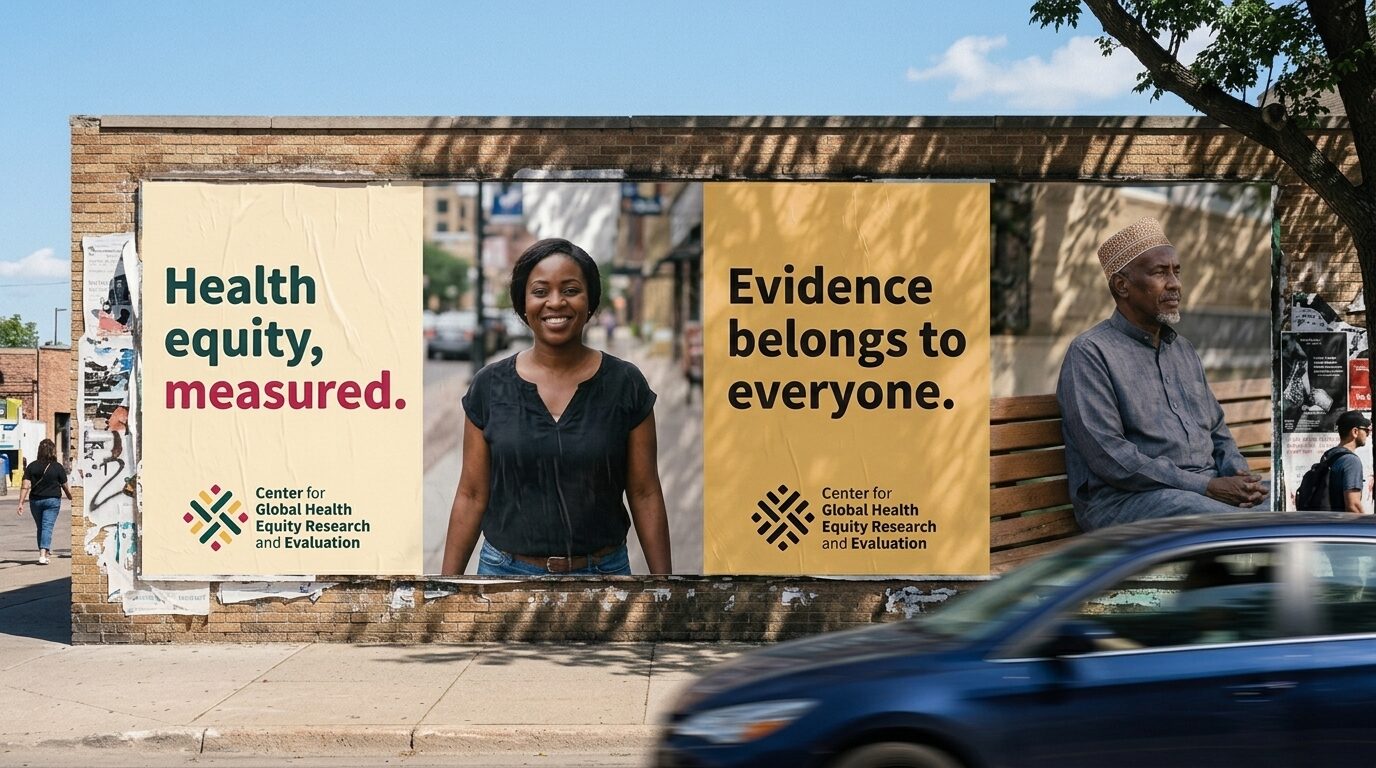
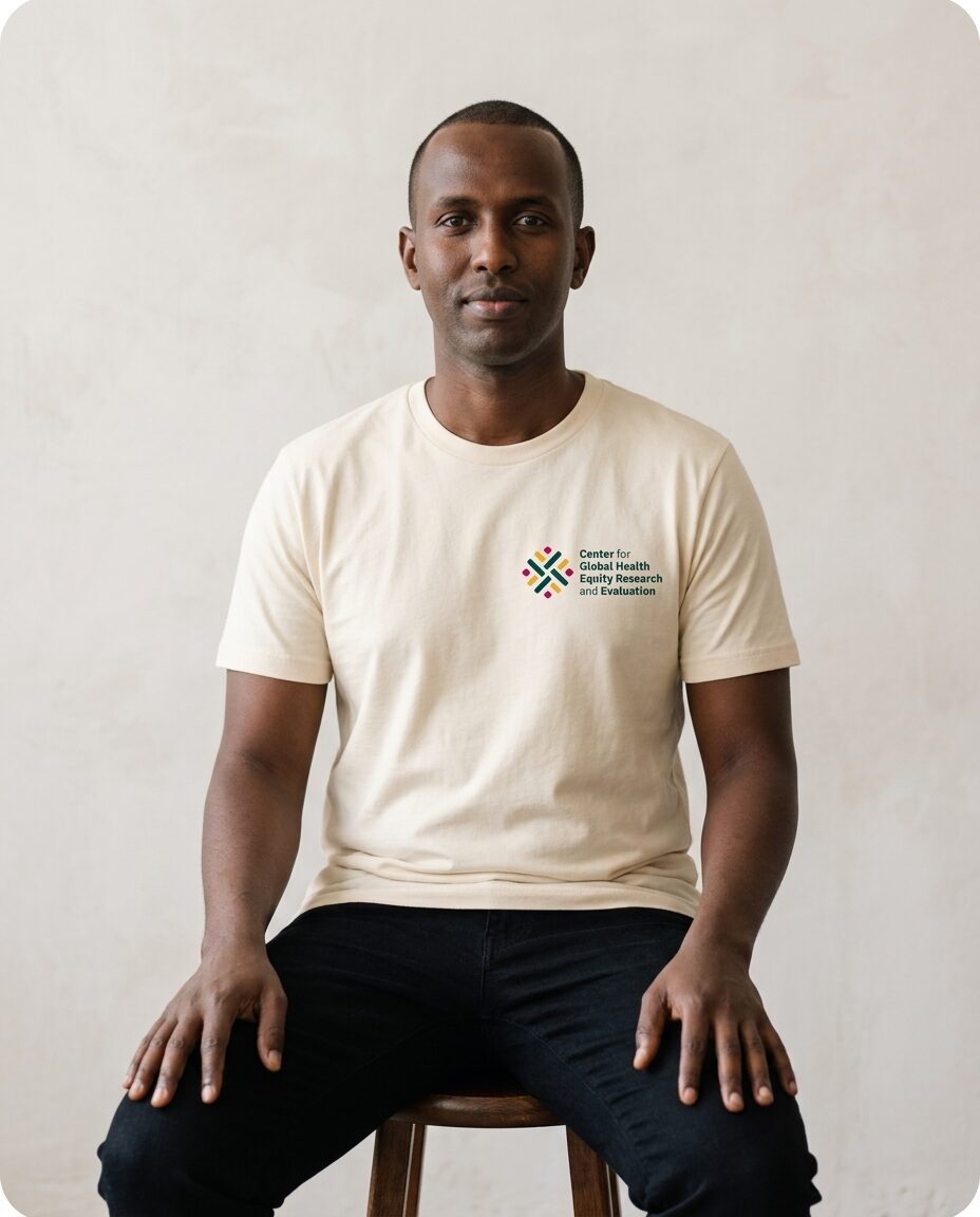
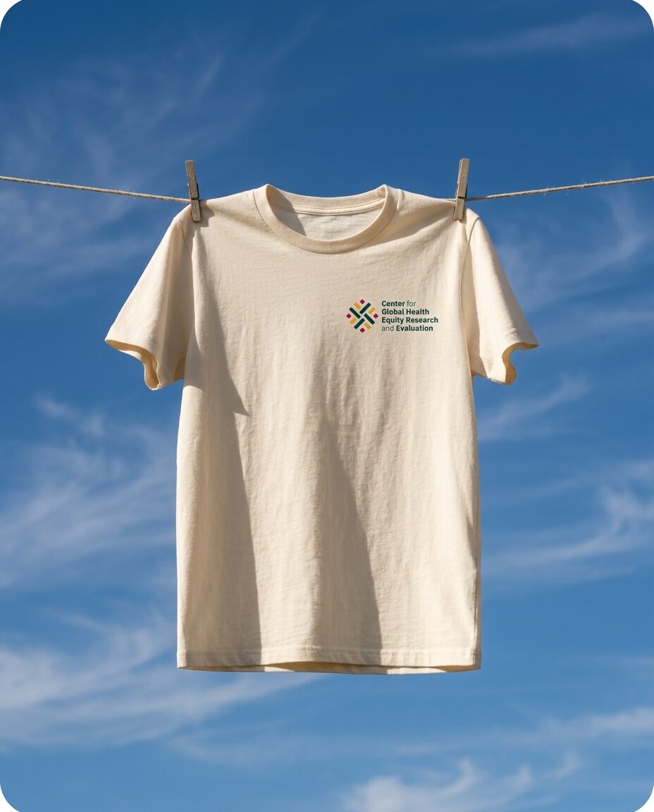
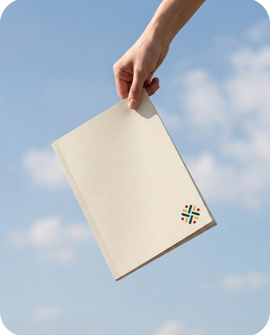
(05)A system is only real once it ships. Transit, print, apparel, and signage, all drawn from the same six colors and two typefaces.
Phase 3, in build
(07)The identity now feeds a component library: tokens, buttons, cards, forms, navigation, and full page layouts for the cghere.org build. Design complete, not yet shipped.
(Outcome)
CGHERE’s first event ran fully branded.
An August summit: signage, banners, and collateral.
Up next
(03)More of the work
 Raji’s portfolio
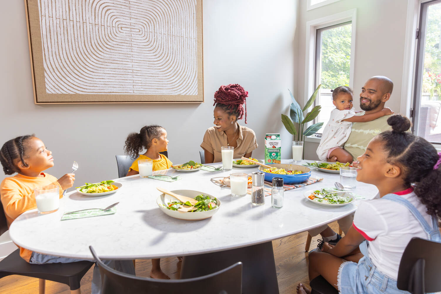
Organic Valley
Four years as Creative Lead of Video Production. National campaigns and the iHeartRadio spots.
Open case study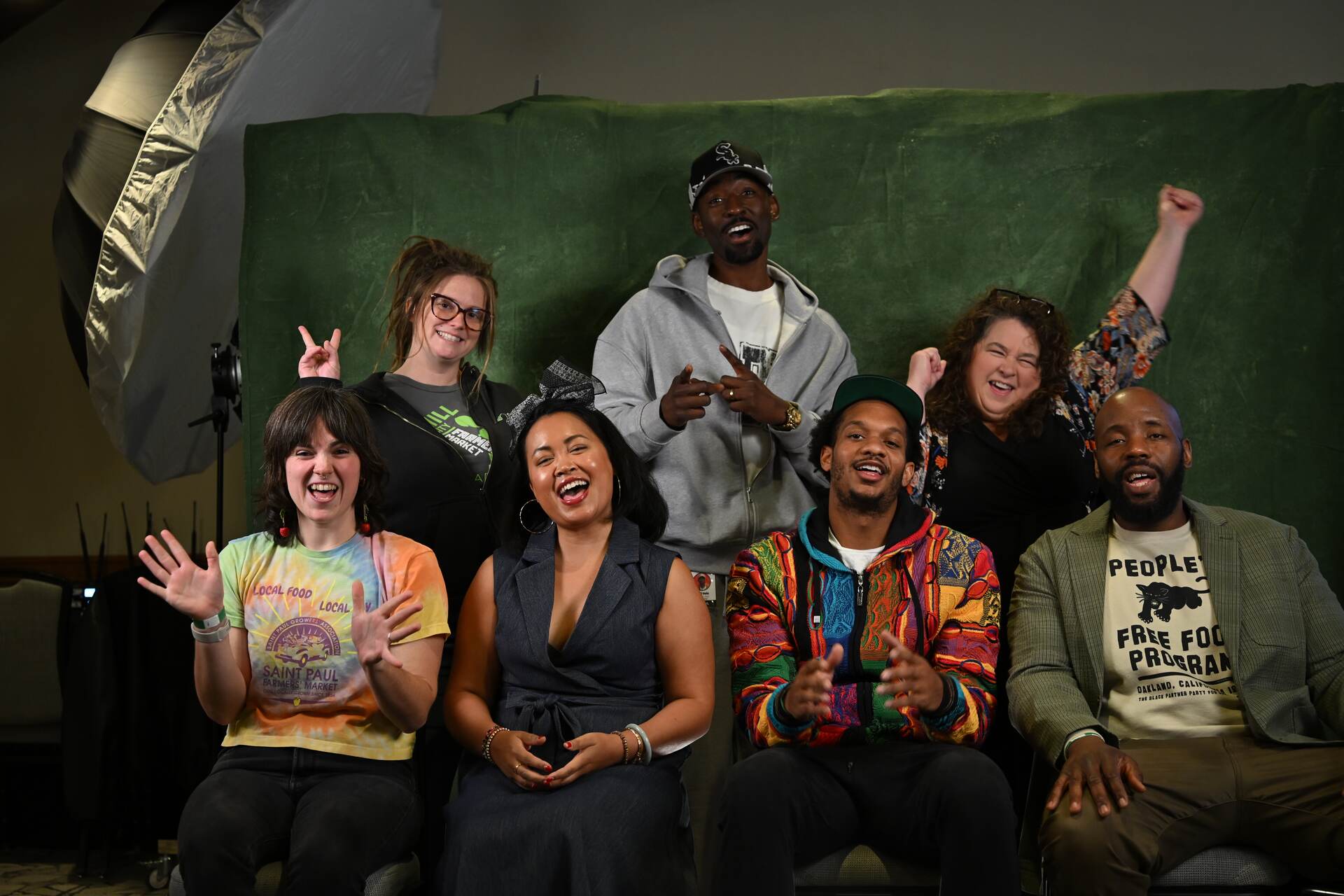 Agriculture
Grow Your Green
Training, a talk show, and a headshot studio for emerging farmers.
Open case study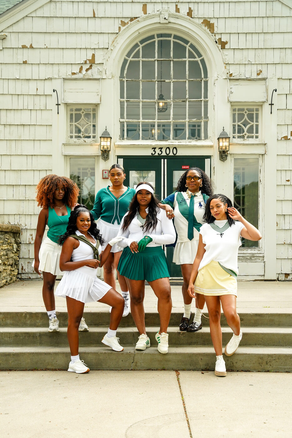 Film
Houston White × Target
Campaign spot, directed, shot and cut.
Open case studyYour identity should survive contact with the world.
Mark, palette, type, guidelines, and every application, built as one system and documented so your team can run it.
Brand Identity
The social system
(06)Profile, grid, and post templates built on the same palette. Gold carries the loudest moments. Raspberry carries one emphasis per view, never more.